

 Zitieren
i like it...
Ergebnis 1 bis 20 von 20
Thema: Yes it is true..........
-
13.04.2007, 14:48 #1Yacht-Master

- Registriert seit
- 04.03.2004
- Beiträge
- 1.577
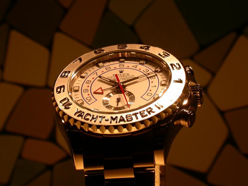
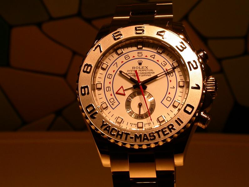
Yes it is true..........
I am not sure if this one or the Leopard Daytona is worst.
Jocke
-
13.04.2007, 14:50 #2Daytona
- Registriert seit
- 23.02.2006
- Ort
- Wien
- Beiträge
- 2.410
...auch eine kaputte Uhr hat 2x am Tag recht.
Gruß,
Flo
-
13.04.2007, 14:51 #3Administrator
- Registriert seit
- 14.02.2004
- Beiträge
- 29.591
Thanks Jocke. More pics please
 Gruß, Hannes
-
13.04.2007, 14:54 #4Partyminister
- Registriert seit
- 16.12.2004
- Beiträge
- 12.999
but not of the YM

nice pic!
-
13.04.2007, 15:00 #5Deepsea
- Registriert seit
- 22.11.2006
- Beiträge
- 1.206
Hi Joke, nice pic of a Breitling!
 Hommage an den letzten echten Liner, der den Finanzzwängen unserer kurzlebigen Zeit 2008 zum Opfer gefallen ist!
-
13.04.2007, 15:39 #6Deepsea
- Registriert seit
- 09.02.2005
- Beiträge
- 1.230
This watch looks really weird ...

Did the minute hand actually catch someone's eye? Gruß, Reza

-
13.04.2007, 15:43 #7
Well Jocke, thought you like the Yachtmaster....
Gruß Percy

"Ferner wird hier auch auf Ihrem Profil sehr viel Diversität benötigt."
-
13.04.2007, 15:45 #8Day-Date

- Registriert seit
- 05.09.2006
- Beiträge
- 4.076
disgusting design. generally i d do like a small second, however, in this combination...
Christian
Jedem Menschen ist das Denken erlaubt, vielen bleibt es aber erspart.
-
13.04.2007, 18:44 #9PREMIUM MEMBER
- Registriert seit
- 02.05.2006
- Ort
- UAE
- Beiträge
- 5.779
Beautiful!
Ein richtiger Lude, das weiß jeder Anfänger im Gewerbe, trägt seinen Notgroschen am Handgelenk: eine Armbanduhr der Marke Rolex
(Der Spiegel 02.05.1983)
Beste Grüße Manuel
-
13.04.2007, 19:06 #10ehemaliges mitgliedGastIt is open, but just only one hand and not the entire dial, like Zenith&Co.Original von Reg
Did the minute hand actually catch someone's eye?
Gr,
István
-
14.04.2007, 01:47 #11Freccione
- Registriert seit
- 11.12.2005
- Beiträge
- 6.499
 grüsse,
niels
-
14.04.2007, 07:24 #12Freccione
- Registriert seit
- 11.10.2004
- Beiträge
- 5.792
this one.
-
14.04.2007, 17:02 #13Deepsea
- Registriert seit
- 16.09.2006
- Ort
- Lower Saxony
- Beiträge
- 1.256
what a machine.....
...was mein Arm aushält, hält auch meine Rolex aus.
Gruß, Gunnar
-
15.04.2007, 17:09 #14Day-Date
- Registriert seit
- 21.01.2005
- Ort
- Göttingen
- Beiträge
- 3.538
RE: Yes it is true..........
Kill me, but i like it. Only the Yachtmaster logo is too much.
-
15.04.2007, 20:32 #15
Compared to the Leo-Daytona this is a real beauty
lg Michael

-
24.04.2007, 22:18 #16Mil-Sub
- Registriert seit
- 30.06.2004
- Ort
- RV
- Beiträge
- 12.005
really ugly but much nicer than the Leo D...
Viele Grüße, Manuel
-
25.04.2007, 00:47 #17Air-King
- Registriert seit
- 22.04.2007
- Beiträge
- 9
The Leo is definitly something for markets where people have their own oilfields in the backyard... i think it doesnt match the average European taste.
The new YM looks like they carried things to far.
But so far i saw only Pics in Gold with white face. Maybe it looks better in steel with a more decent color combination.
-
25.04.2007, 12:20 #18Orange Hand
- Registriert seit
- 18.02.2004
- Ort
- Norddeutschland
- Beiträge
- 10.538
well, i don't like the design of case and dial, but the hands are beautiful...
Gruß Florian
-
25.04.2007, 12:42 #19Submariner
- Registriert seit
- 02.04.2006
- Beiträge
- 365
This ist not exactly the most beautiful watch... I don't think the Leo is worse, because it's a nice watch just suffering from an overdose of gem. However, the YM II is just a failure down the line.
Maybe we'll get used to it. Gruß
Gruß
Oyster-One
"Money is better than poverty, if only for financial reasons..." (W. Allen)
-
30.04.2007, 06:57 #20Mil-Sub
- Registriert seit
- 26.06.2005
- Beiträge
- 11.879
This one is definitely the worst one in the whole collection.


Ähnliche Themen
-
True colors>>>>>
Von Jocke im Forum A. Lange & SöhneAntworten: 8Letzter Beitrag: 03.11.2010, 11:42 -
Omega - true love or true blues?
Von market-research im Forum OmegaAntworten: 92Letzter Beitrag: 20.04.2006, 08:36 -
My True Love...
Von HG2 im Forum Rolex - Haupt-ForumAntworten: 13Letzter Beitrag: 18.05.2004, 18:01

Lesezeichen